CREDIT HUB
Eight apps. Zero cohesion. I built the unified ecosystem that replaced them all.
A UK credit company operated 8+ disconnected financial apps across different brands. I audited the entire ecosystem, benchmarked against Monzo and Revolut, and designed a single app that unified every product under one bold new identity.

I inherited an ecosystem, not an app
The client operated 8+ separate financial products — from consumer credit cards to BNPL, from credit-building tools to white-label partner apps. Each had its own branding, navigation, and UX quality.
A user who held both a credit card and a credit-builder product had to download two separate apps, learn two different interfaces, and manage two separate logins. Meanwhile, Monzo and Revolut offered everything in one screen.
Business Risk
Fragmented identity
8+ apps with different brand languages diluted recognition and prevented cross-selling between products.
User Impact
Broken trust loop
Users managing credit — a high-anxiety domain — needed one calm, authoritative source of truth. They got 8 conflicting ones.
Opportunity Cost
Competitive gap widening
Monzo's unified dashboard, Revolut's all-in-one platform, and Starling's insights model set expectations the client couldn't meet.
My Role
I led the full design engagement end-to-end — from ecosystem audit through final UI direction.
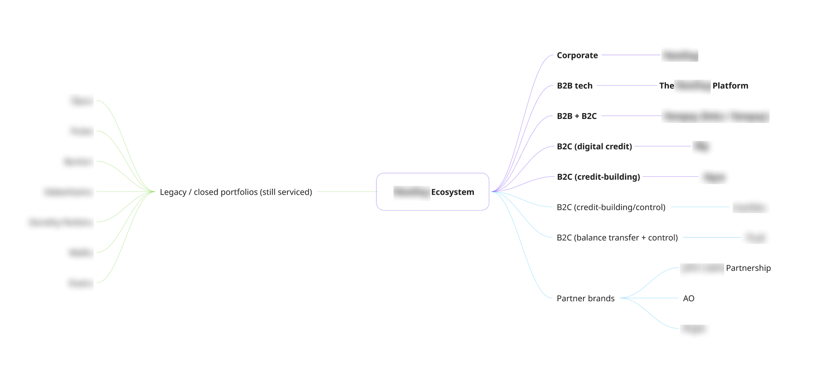
I mapped an ecosystem nobody had seen whole
Before designing anything, I needed to understand everything. I audited every existing app, studied the business model, and mapped the entire product portfolio.
Ecosystem Mapping
I built a complete product ecosystem mindmap covering every brand and product line: Corporate, B2B tech platform, B2C digital credit, credit-building brands, balance transfer products, BNPL partnerships, and legacy portfolios.
This map became the single source of truth for understanding which products served which users — and where the overlaps created confusion.
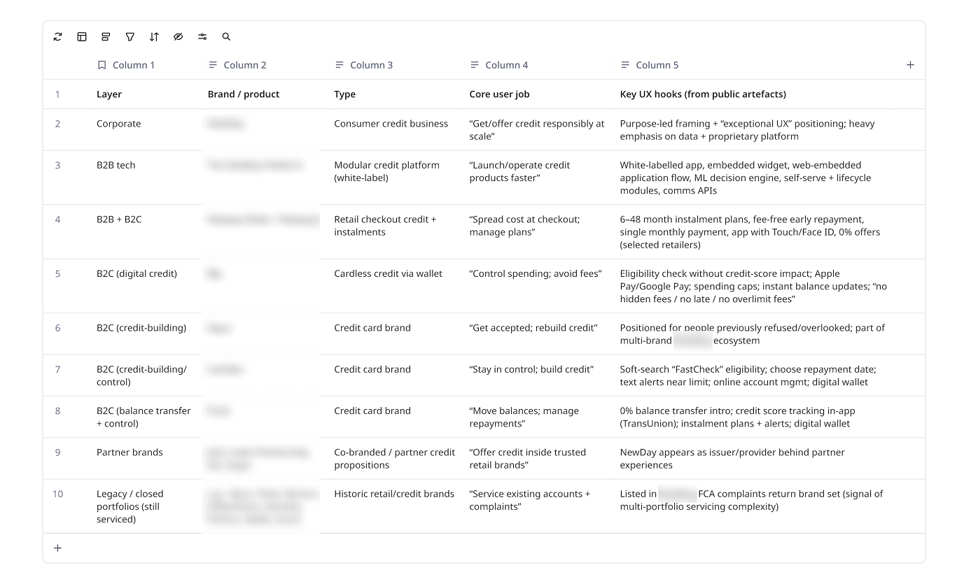
Business Deep-Dive
For each product I documented: brand identity, product type, core user job, and key UX issues discovered from public reviews and direct analysis.
The pattern was clear: every app duplicated basic credit management features (balance check, payment, alerts) with different quality levels and naming conventions.
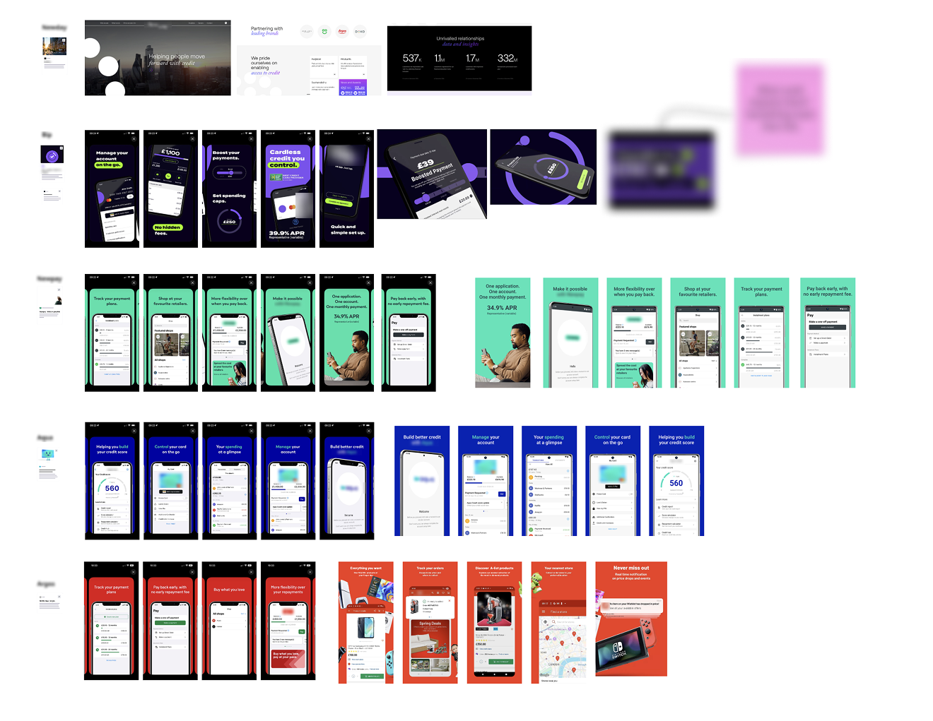
Complete visual audit of all existing apps — 6+ brand identities, inconsistent navigation, duplicated features.
I studied the best — and the closest
I ran a two-tier competitive analysis. Tier 1: aspirational fintechs (Monzo, Revolut, Starling) that defined what "great" looks like.
Tier 2: direct category competitors (Vanquis, Capital One UK, Barclaycard, Klarna) fighting in the same credit space.
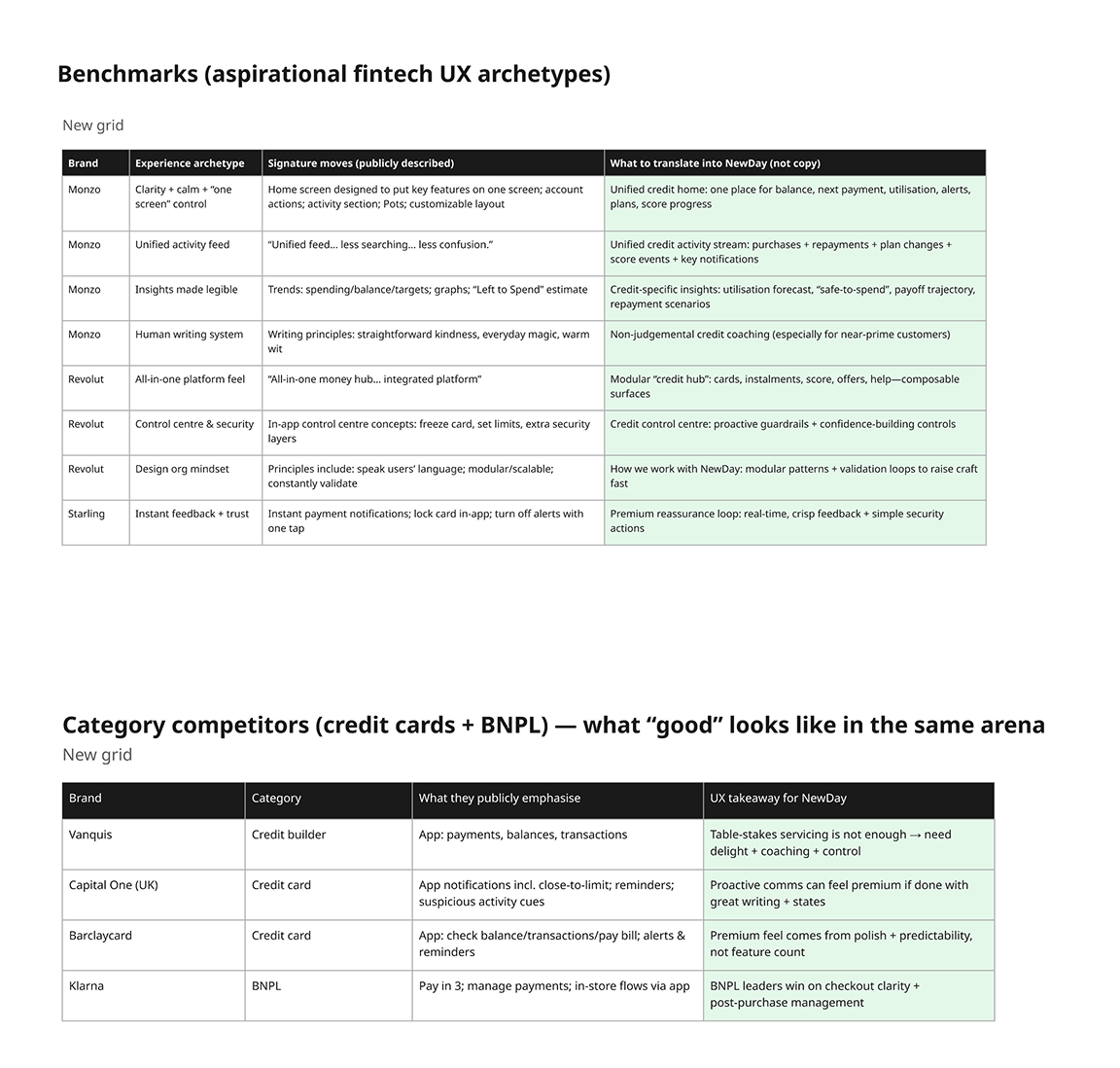
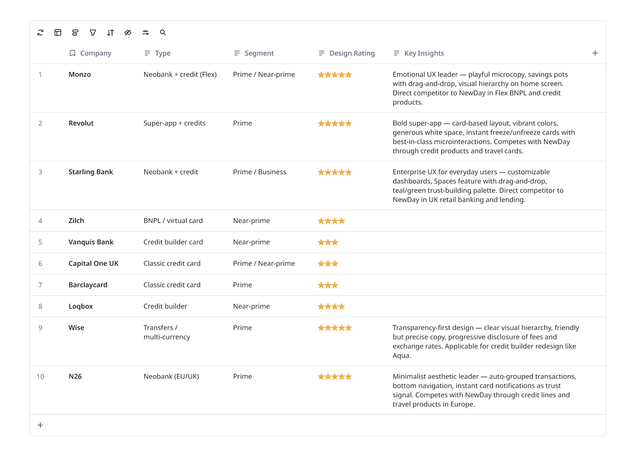
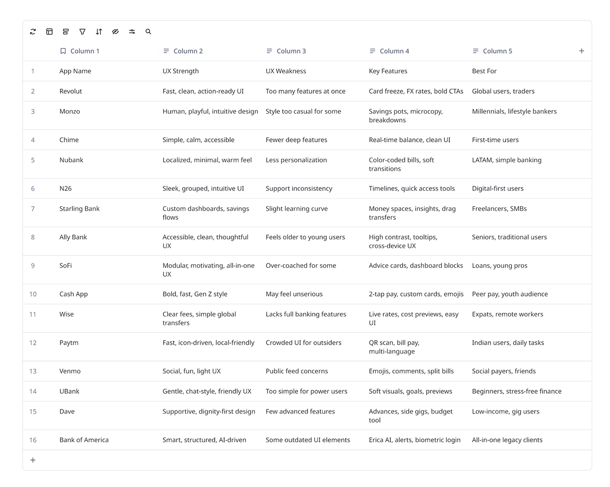
Beyond direct competitors, I analyzed the top 15 banking apps globally with the strongest UX design — creating a feature-by-feature comparison of what makes each one exceptional and how those patterns could transfer to our context.
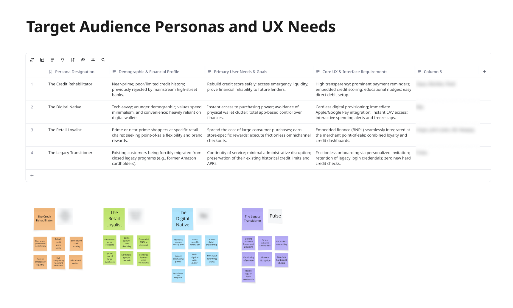
I defined four people this app needed to serve
From business research and competitor analysis, I synthesized 4 distinct user personas representing the full spectrum of the company's customer base.
Users weren't confused by credit — they were confused by us
The research surfaced a core truth: users understood their finances. What they didn't understand was why they needed 8 different apps to manage them.
Core Insight
The problem wasn't that users had too many financial products. It was that no single interface gave them a unified sense of control over all of them.
I designed one concept to replace eight apps
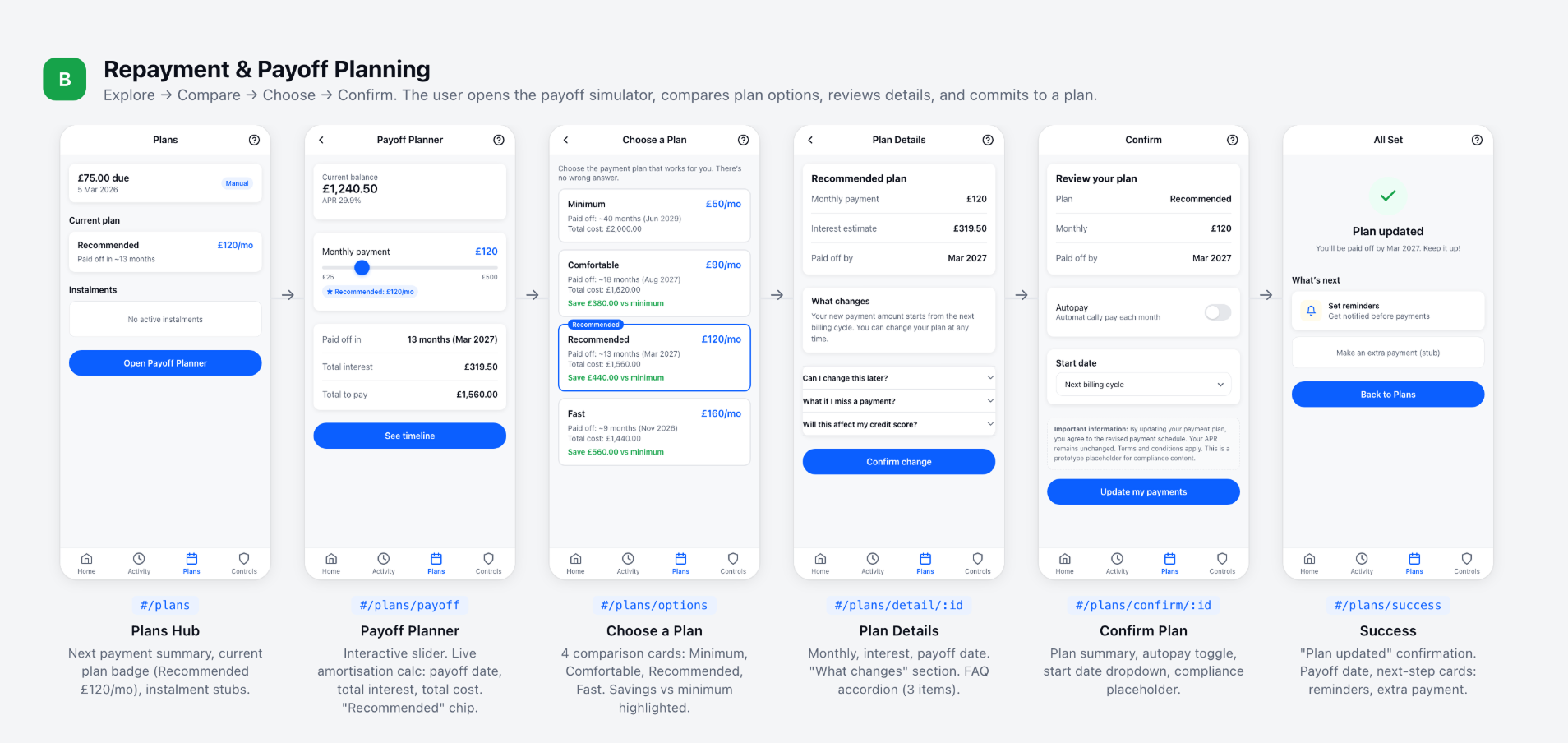
I defined the "Credit Hub" concept — a single app experience that works across all brands and products. The design follows one North Star loop: Understand → Control → Improve → Reward → Repeat.
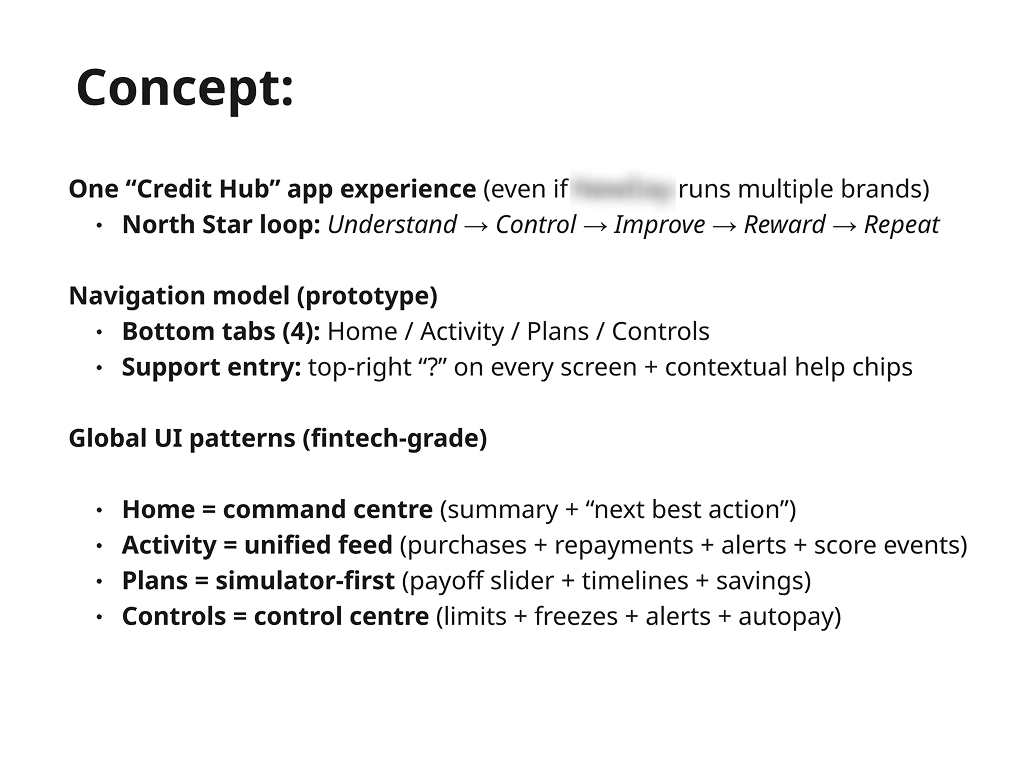
The Architecture
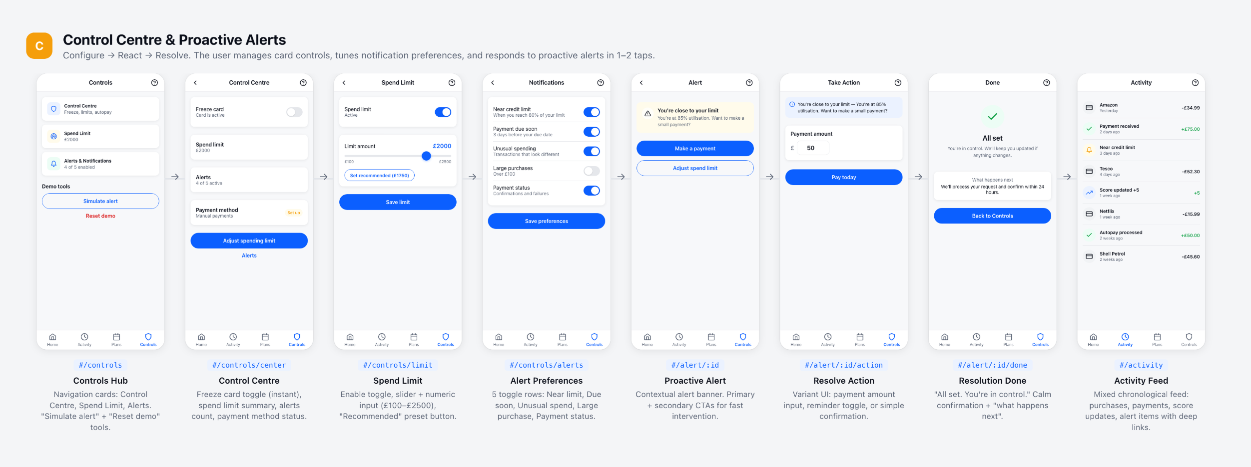
Bottom navigation with 4 tabs: Home (command centre), Activity (unified feed), Plans (simulator-first payoff planning), Controls (security and spending limits).
Every screen gets a top-right "?" for contextual help and chip-based navigation for sub-sections. The entire structure maps to the 4 user personas.
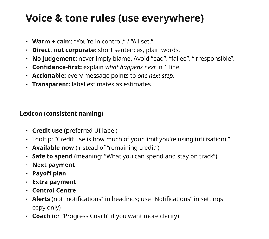
I rewrote how the app talks to people
I established voice and tone rules that every screen follows: warm + calm, direct not corporate, no judgement, confidence-first, actionable, transparent.
I created a lexicon with specific word choices: "Credit use" not "utilisation", "Safe to spend" not "remaining credit", "Coach" not "advisor". Every word was chosen to build confidence, not anxiety.
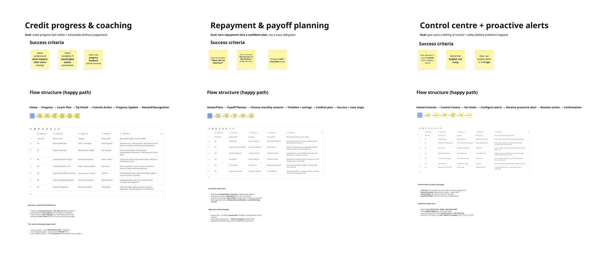
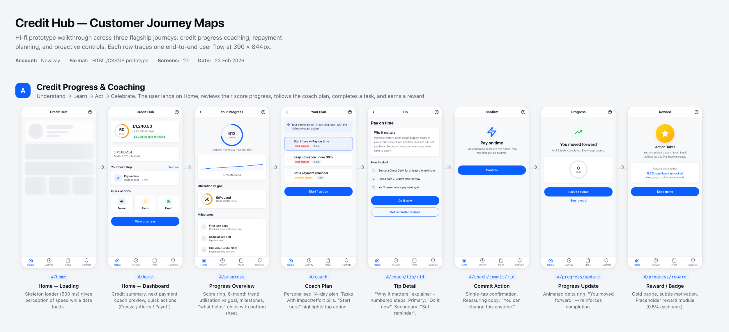
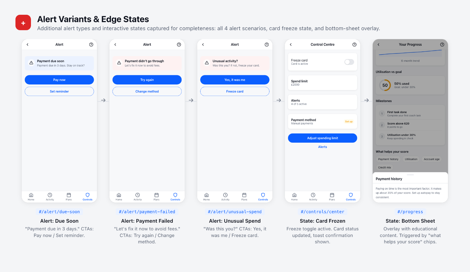
I mapped three flagship journeys screen-by-screen
I designed detailed customer journey maps for the 3 core scenarios — each with hi-fidelity wireframes, step-by-step user flows, success criteria, and feature mapping from the competitor best practices I'd identified.
I built the visual vocabulary before touching pixels
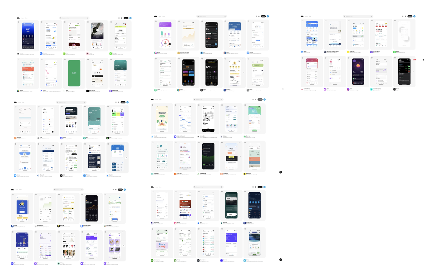
I curated an extensive moodboard and inspiration collection — studying fintech app patterns, bold typography treatments, dark/light theme executions, and device presentation styles that could elevate the Credit Hub brand above commodity competitors.
I built 6 live prototypes before opening Figma
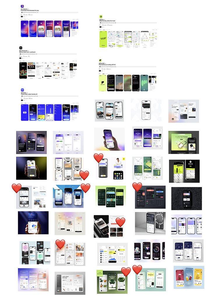
Instead of starting in static design tools, I used AI coding assistants to rapidly generate live, interactive prototypes. Each explored a different visual direction and interaction model for the Credit Hub dashboard.
This approach produced testable interfaces in hours, not days. I identified the optimal information architecture and interaction patterns before investing in pixel-perfect design.
V1: Light + minimal
V2: Dark + gradient
V3: Dark + coaching
V4: Dark + dense
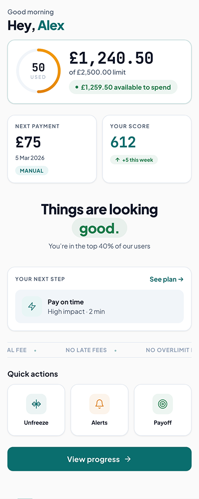
V5: Light + teal
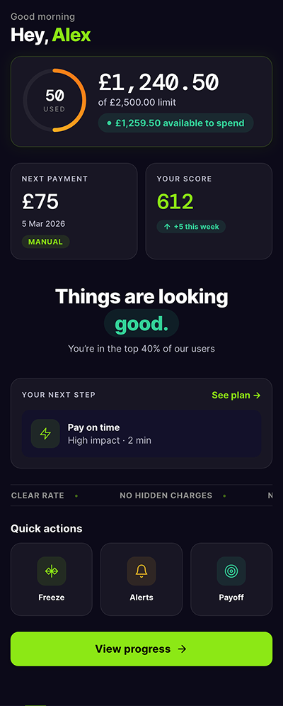
V6: Dark + lime
What AI Solved vs. What It Couldn't
AI prototyping excelled at interaction model, information architecture, and layout hierarchy — I validated the optimal data density and navigation patterns across 6 variations in under a week.
But achieving the precise visual craft and brand personality required Figma. AI generated the structure; I designed the soul.
I refined AI output into 4 distinct directions in Figma
Taking the validated architecture from code prototypes, I created 4 unique visual directions in Figma — each exploring a different brand personality and color strategy for the new Credit Hub identity.
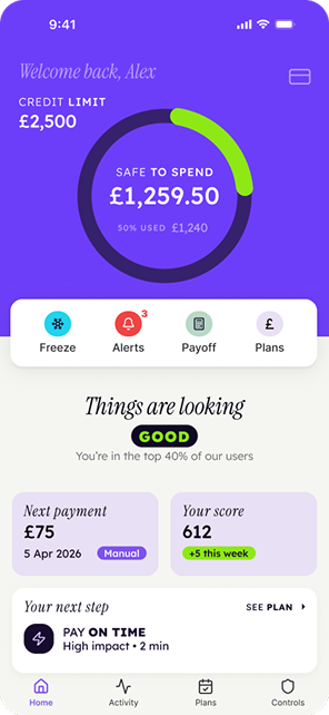
Direction A: Purple bold
Direction B: Light gradient
Direction C: Maximalist
Direction D: Refined
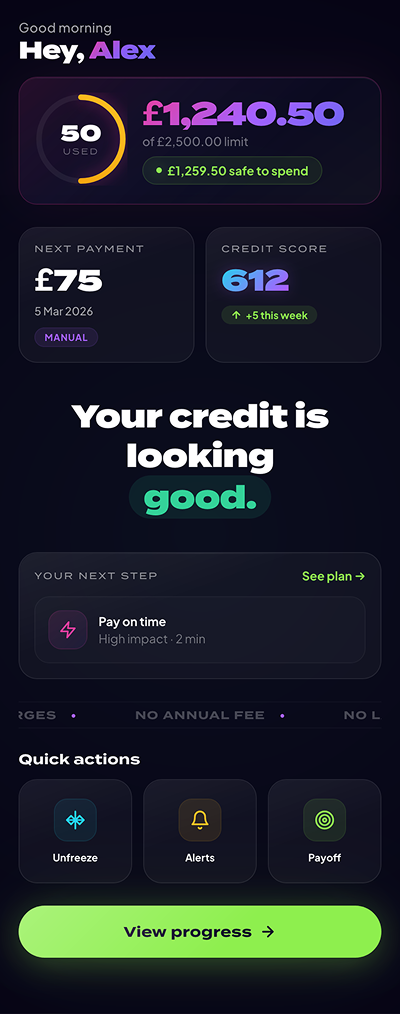
I chose the direction nobody expected — and it became the brand
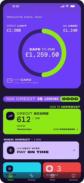
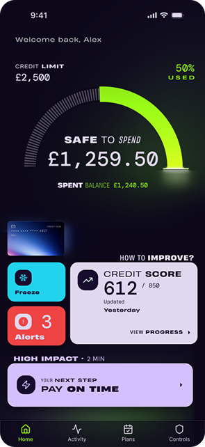
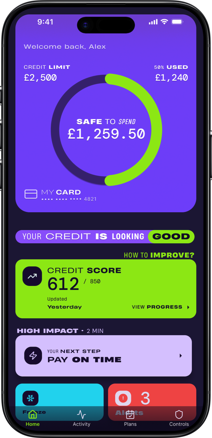
After client feedback across all 4 Figma directions, the winning concept combined bold purple/violet primary branding with lime green accents. A palette that broke completely from the client's existing apps and from every competitor in the category.
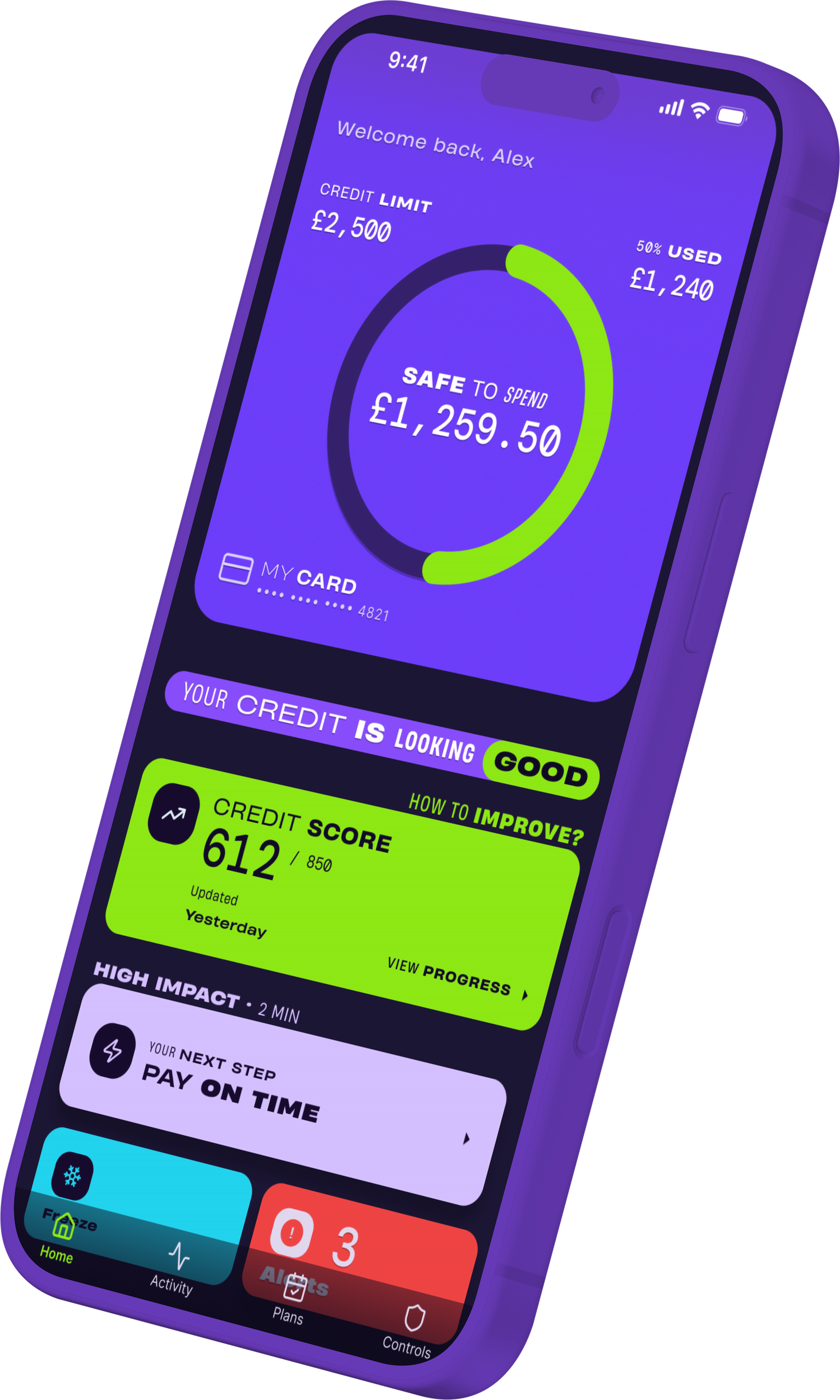
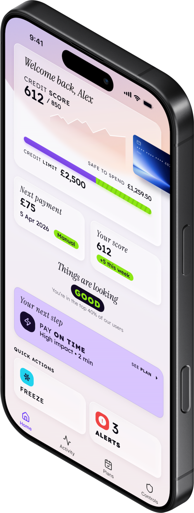
"Safe to Spend" became the hero metric, and "Your credit is looking good" became the confidence-building anchor. The bottom navigation (Home / Activity / Plans / Controls) unified every product function into one mental model.
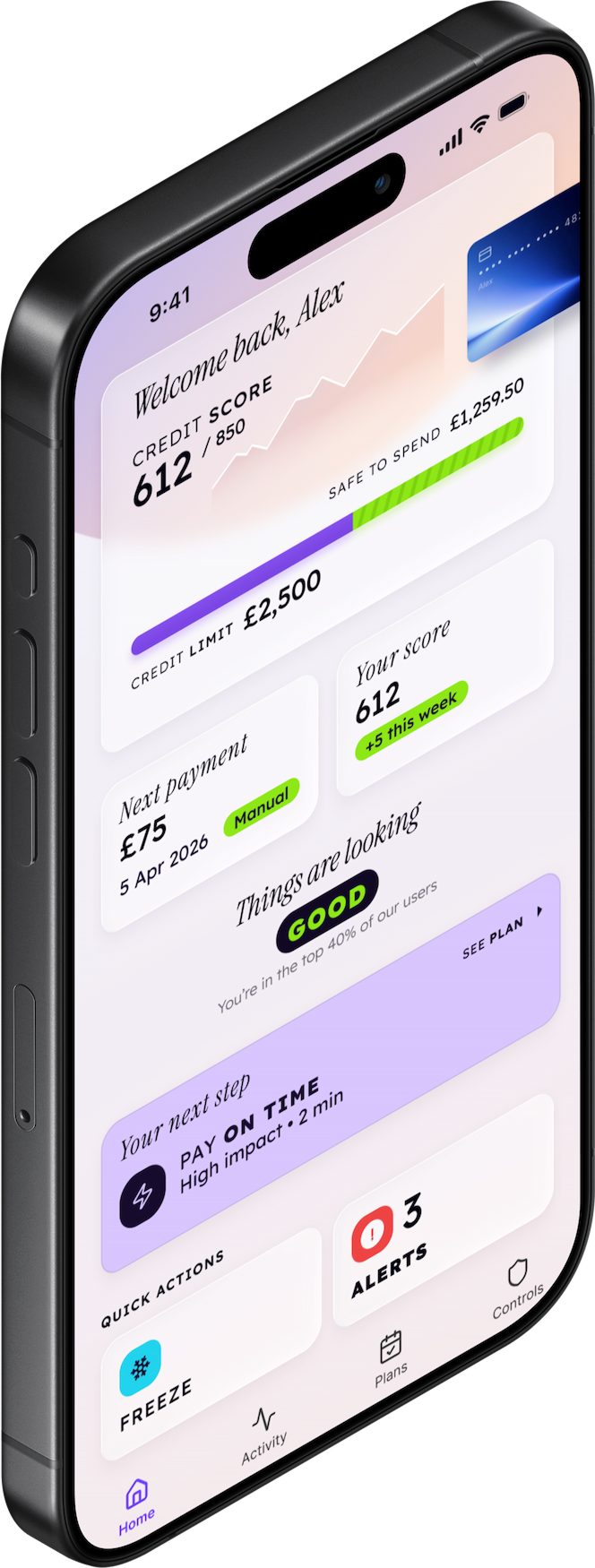
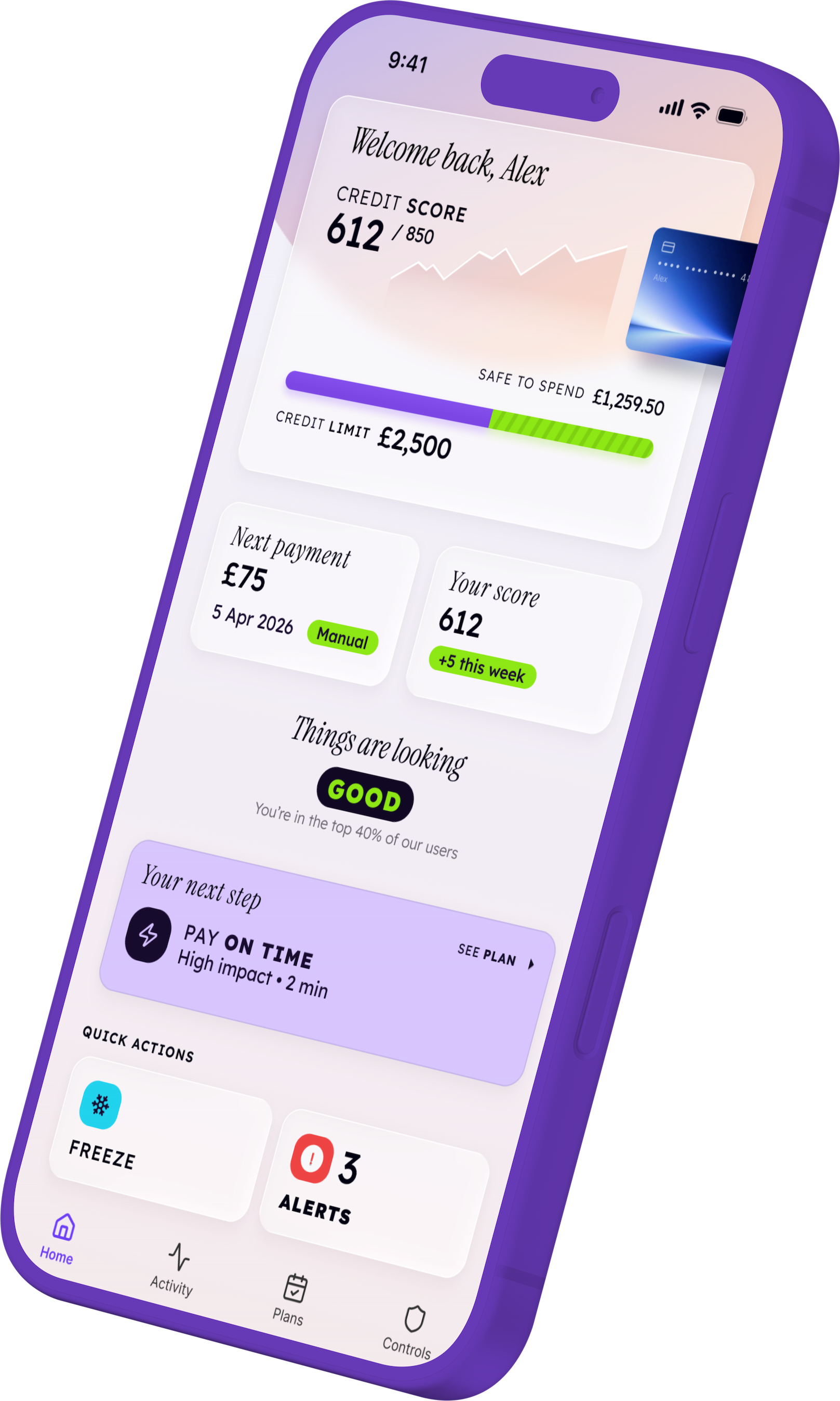
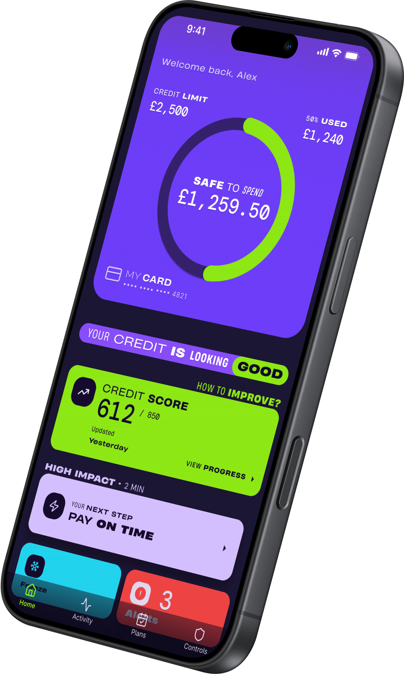
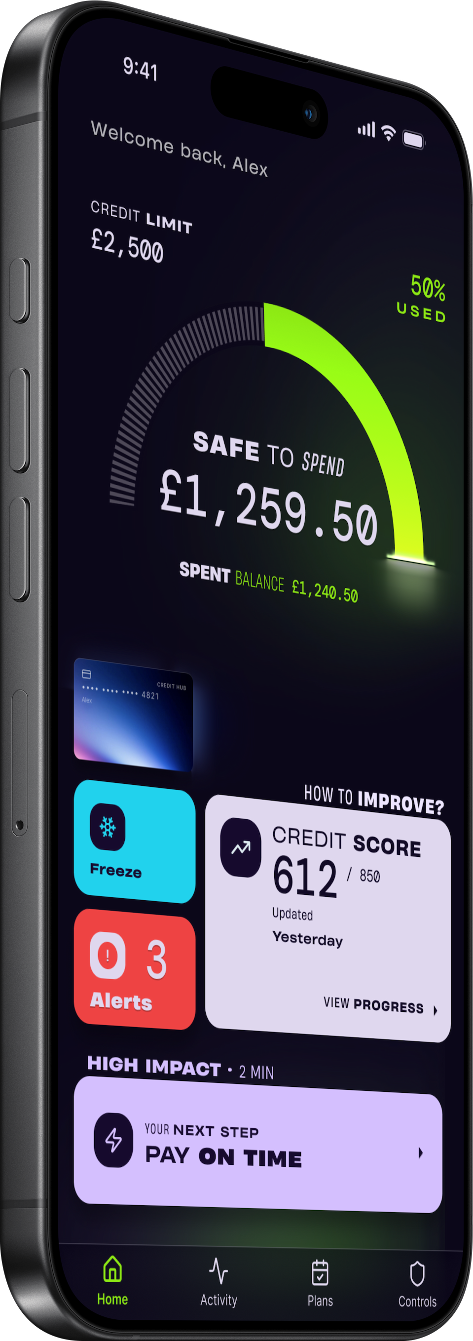
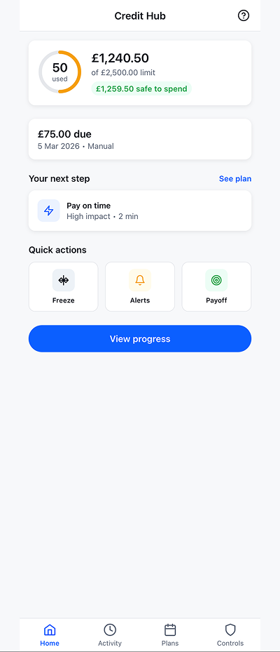
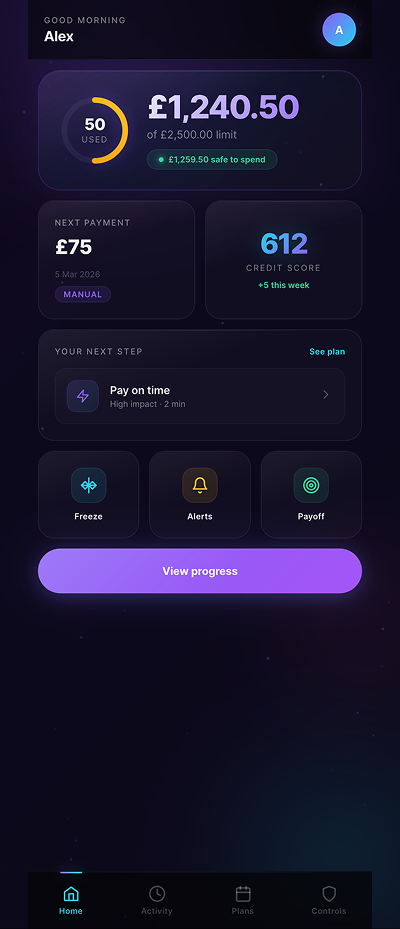
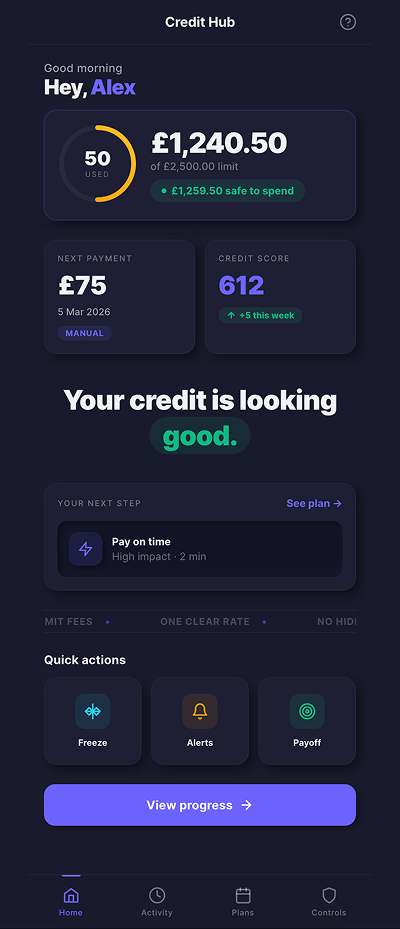
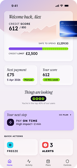
Home = Command Centre
Everything in one glance
Credit limit, safe to spend, next payment, credit score, coaching step, and quick actions — all visible without scrolling. The dashboard replaced 3 separate app home screens.
Coaching System
"Your credit is looking good"
Confidence-building language replaces clinical status updates. The "Your next step" card provides one high-impact action with estimated time ("Pay on time · 2 min") — users feel guided, not lectured.
Control + Safety
Freeze, alerts, payoff in one tap
Quick actions (Freeze, Alerts, Payoff) are always accessible from the home screen. The Control Centre provides spending limits, alert preferences, and proactive notifications — bringing Revolut-level control to credit products.
Seven weeks from audit to final direction
From 8 fragmented apps to one unified brand
The Credit Hub concept established a design foundation that unifies the company's entire consumer-facing product line under one brand identity, one navigation model, and one voice.
The winning direction — bold purple with lime accents — creates instant differentiation in a market where competitors default to blue-on-white. The coaching system ("Your credit is looking good") reframes credit management from anxiety to confidence.
What Changed
Unified identity
One app, one brand, one navigation model across all credit products — replacing 8+ separate apps with inconsistent UX.
What Changed
Competitive parity
Feature mapping from Monzo, Revolut, and Starling ensures the Credit Hub meets or exceeds fintech-grade UX expectations.
What Changed
Design foundation for scale
The concept, voice & tone rules, navigation model, and component patterns form a system that supports future product expansion without design fragmentation.
What this project taught me about ecosystem design
Audit the ecosystem before designing the product
Starting with the ecosystem map — not wireframes — revealed that the real problem was organisational fragmentation, not UI quality. The design strategy changed completely once I understood the product portfolio as a system.
AI prototyping validates architecture faster than Figma
Building 6 live prototypes with AI let me test information density, navigation patterns, and coaching language interactively. Figma was essential for visual craft, but AI was essential for structural decisions. The two tools have different jobs.
Credit users need confidence, not simplification
The personas revealed that "making it easier" often meant "making it feel patronising." The coaching approach — "Things are looking good" with specific improvement steps — respected users' intelligence while guiding their behaviour.
What I'd ship next
The concept phase delivered a strong foundation, but two areas remain open for the implementation phase.
Ship Next
Micro-interaction specification
The journey maps define screen-to-screen flows, but transition animations and haptic feedback patterns need detailed definition for the development handoff.
Ship Next
Component-level accessibility audit
The bold purple/lime palette needs contrast verification at every component state (focus, hover, disabled) before build.
Ship Next
Multi-product onboarding flow
The Credit Hub concept assumes users already hold products. A unified onboarding for first-time users hasn't been designed yet.
AI built the skeleton. I designed the soul.
AI tools were integral to the prototyping phase. I used them to explore structural hypotheses at a pace that traditional design tools can't match.
Rapid Interactive Prototyping
Generated 6 live HTML/CSS/JS prototypes exploring different dashboard layouts, data density levels, and light/dark theme variations. Each prototype was interactive and testable within hours of conception.
Structure vs. Craft
AI excelled at information architecture, layout hierarchy, and interaction patterns. Visual brand identity, typography craft, and emotional design required human judgment in Figma. The split: AI for validation speed, Figma for brand precision.
Competitive Intelligence
AI assisted in synthesizing patterns across 15 banking app analyses and structuring the competitive benchmark matrix. I directed the analysis criteria and made all strategic conclusions.
I unify complexity into clarity.
If your product ecosystem needs one coherent experience, I can design it.
Get in Touchmailtotheroman@gmail.com